In today’s fast-paced digital world, your website is often the first interaction a potential customer has with your business. A responsive website design ensures your site automatically adjusts to various screen sizes — whether it’s viewed on a smartphone, tablet, or desktop — creating a seamless experience for every visitor. This approach is no longer optional; it’s crucial for businesses that want to improve engagement, reach a broader audience, and achieve sustainable growth.
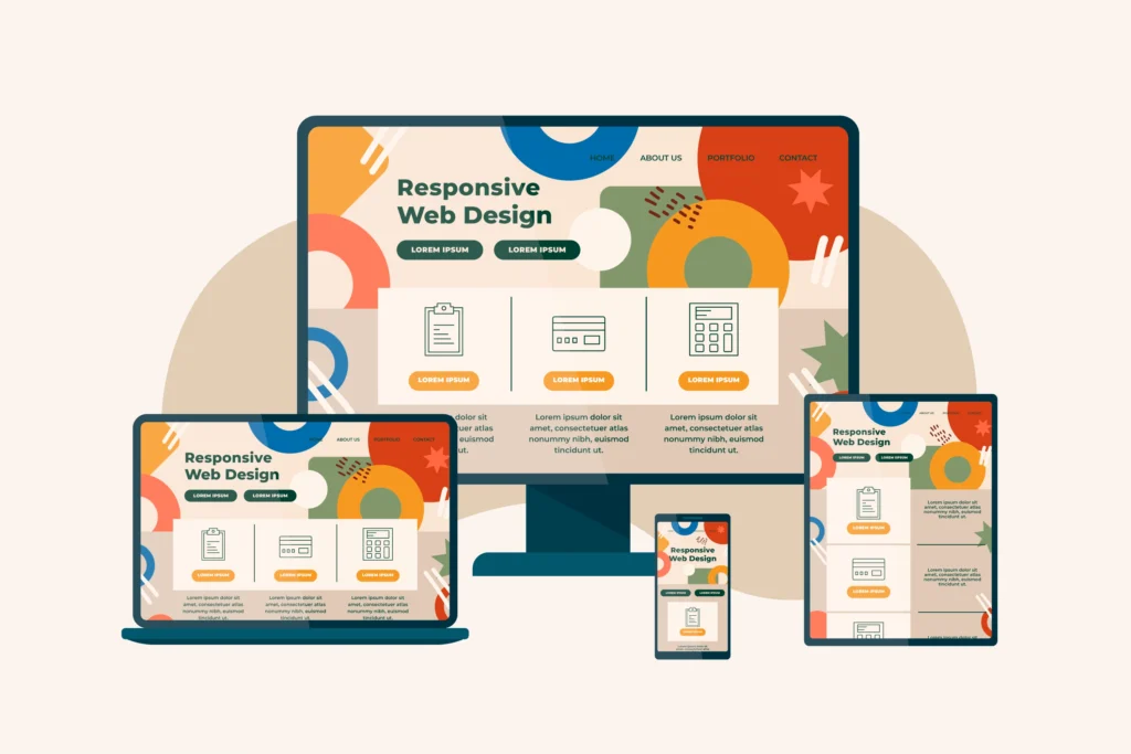
What Is Responsive Website Design?
Responsive website design is an approach where a website dynamically adapts its layout, images, and content to fit any device screen size. This adaptability improves usability across desktops, tablets, and mobile phones without requiring multiple versions of the same website — making it both efficient and effective.
A well-executed responsive site provides:
- Fluid layouts that adjust to screen size
- Readable text without zooming
- Navigation that works on any device
- Consistent interaction elements across platforms
Why Responsive Design Matters for Business Growth
Enhanced User Experience (UX)
One of the biggest benefits of a responsive website design for businesses is the improvement in user experience (UX). When visitors can easily navigate your site regardless of screen size, they stay longer, engage more, and are more likely to take desired actions — like subscribing, contacting you, or making a purchase.
A site that adapts to every device reduces friction and makes content easier to consume, which helps keep bounce rates low and satisfaction high — two key signals Google uses to understand quality.
Broader Reach with Mobile-Friendly Website Design
Mobile browsing accounts for the majority of web traffic today. A mobile-friendly website design ensures your business doesn’t miss out on this massive audience. Responsive design helps you capture visitors who browse and shop on their smartphones, expanding your reach and increasing conversions from mobile users.
Adaptive Website Design vs. Responsive Design
Both responsive and adaptive approaches aim to improve usability, but they differ technically:
- Responsive design fluidly adjusts a single layout to all screen sizes.
- Adaptive design serves tailored layouts for specific device widths.
Despite their differences, both share the same goal: delivering optimized experiences for users — a fundamental requirement for growth in a device-diverse world.
Core Business Benefits of Responsive Websites
Better SEO and Search Visibility
Search engines like Google prioritize mobile-friendly sites. Responsive design helps improve your SEO performance by consolidating your content under a single URL and eliminating duplicate content issues — leading to higher organic rankings and increased traffic.
Increased Conversion Rates
With a seamless experience across devices, users are more likely to complete desired actions. Whether it’s filling out a form, buying a product, or contacting your team, responsive sites reduce friction and increase your chances of turning visitors into customers.
Reduced Maintenance and Lower Costs
Instead of managing separate desktop and mobile versions, a single responsive website saves time and money in development, maintenance, and updates — making your digital presence more efficient.
Consistent Brand Experience
A responsive site ensures your branding — from colors to messaging — appears the same on all devices. Consistency builds trust, which is essential for repeat business and customer loyalty.
How Responsive Design Improves User Experience
A responsive site makes users feel valued by prioritizing ease of use. This includes:
- Readable text without zooming
- Touch-friendly buttons and navigation
- Images and media that scale automatically
- Faster loading times irrespective of device
These factors collectively contribute to a smoother user experience (UX) and help increase overall engagement and conversions.
Measuring Success: Metrics That Improve with Responsive Design
When a website adapts well across devices, businesses often see measurable improvements in key performance indicators like:
Organic Traffic Growth
Lower Bounce Rates
Higher Page Engagement
Better Conversion Performance
These improvements demonstrate how a responsive approach supports your broader business goals.
FAQs About Responsive Website Design
What is Responsive Website Design?
Responsive website design is a strategy where layouts, media, and content adjust automatically to fit various screen sizes and devices — creating a seamless user experience across desktops, tablets, and mobile phones.
What are the benefits of responsive website design for businesses?
Responsive websites help increase organic traffic, improve SEO rankings, enhance user engagement, and boost conversion rates — all of which contribute to stronger business growth.
How does responsive design improve user experience?
By eliminating the need to zoom or scroll excessively, responsive design ensures content is readable and interactive elements are easy to use on any device — significantly elevating the user experience.
Why is adaptive website design important in responsive development?
Adaptive design complements responsive techniques by guiding how layouts change for specific screen sizes. Together, they ensure your site remains optimized across the widest possible range of devices.
How does responsive design impact conversion rates?
Responsive design reduces user frustration and makes key calls to action more accessible on every device. This smoother digital journey often leads to higher conversion rates and improved business outcomes.
Final Thoughts
Responsive website design is no longer just a trend — it’s a strategic investment. With mobile usage dominating the online landscape, businesses that invest in adaptive, mobile-friendly website design position themselves for stronger engagement, wider reach, and higher conversions. Whether you’re a small start-up or an established enterprise, a responsive website lays the foundation for meaningful, sustainable business growth.
Ready to fuel your business growth with a responsive design? Contact us for a free strategy call.